Tips and Miscellaneous Notes
Using the Dashboards
Drilldowns
Many charts on the dashboards can be drilled down to show a list of the learners that comprise a particular value. If a value can be clicked to show a drilldown, the mouse cursor will change to a hand.

These will open in an expanded view to give a clearer view of the data. Click the  button at the top right to return to the main dashboard view.
You can also export a drilldown to CSV, PDF or Excel by clicking the  button at the top right then clicking one of the following buttons:
-
 CSV
CSV -
 PDF
PDF -
 Excel
Excel
To show the top-level chart again rather than the drilldown, click the  button.
Expanding and collapsing charts
To view a larger, expanded version of a chart, click the  button at the top right of a chart. This is especially useful for charts which are small on a dashboard or where there is a lot of data that is clearer to analyse in the expanded view.
Click the  button at the top right to return to the main dashboard view.
Resizing the screen
The BI dashboards are responsive, meaning they will re-size and show or hide certain features depending on the available screen or browser size.
In some cases there will be chart keys which do not display due to limited screen space. To view the key, you can try increasing the available space if possible (e.g. increasing the window size of your browser), but the best way is to expand the chart so that it uses the full size of the dashboard.
Filtering data
To filter the data on the dashboard:
-
Click the
 button at the top right. This will display the filters pane.
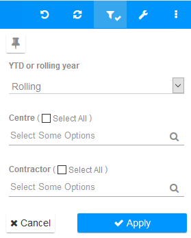
- Set the filters as required.
- Click Apply.
YTD or rolling year determines the time period used for the charts. The default of Rolling shows a rolling 12 month period, ending with the most recently completed month (e.g. on 30/11/2020 you would see months from Nov 2019 to Oct 2020. On 01/12/2020 this would change to showing Dec 2019 to Nov 2020). The YTD option shows all completed months from the current contract year.
The Centre and Contractor options allow you to select which centres and contractors to filter by. Multiple values can be selected for each.
You can remove a centre or contractor filter by clicking the x button next to a value.

To clear all filters on a dashboard, click the  button on the top right of the toolbar.
Selecting groups on a chart
On charts where there is a key displayed to the right, you can select one or more specific groups so that the chart only shows data for those groups. This can be useful for charts where there are many groups that you want to differentiate.
The example below shows a chart with all groups selected (left) and a chart with only groups 3 and 6 selected (right):
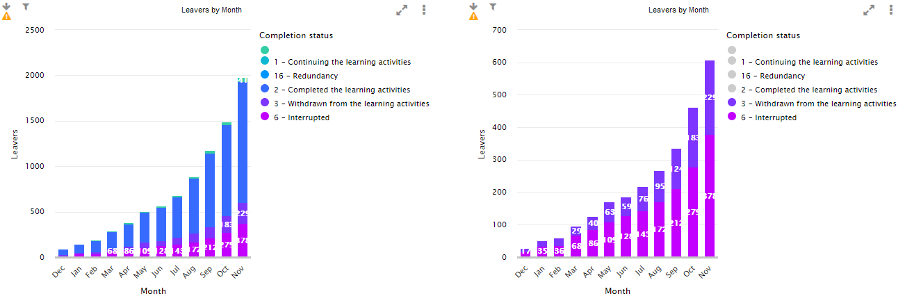
You can reset the groups to the default view by clicking the groups you've already selected to de-select them, or by clicking the  button on the top right of the toolbar.
How to Set Chart Targets
Some charts, such as lightbulb charts which produce a single figure, can be given targets so that the chart displays different colours depending on which target it meets. An example of a chart which has targets set by default is the Target Variance chart on the Business Health Check dashboard, which shows green for a positive value and red for a negative value.
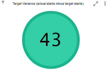
To set targets for a chart:
- Click the
 button at the top right of the chart and click the
  button on the toolbar that appears.
 -
The Edit Chart screen will appear. Go to the Targets tab.
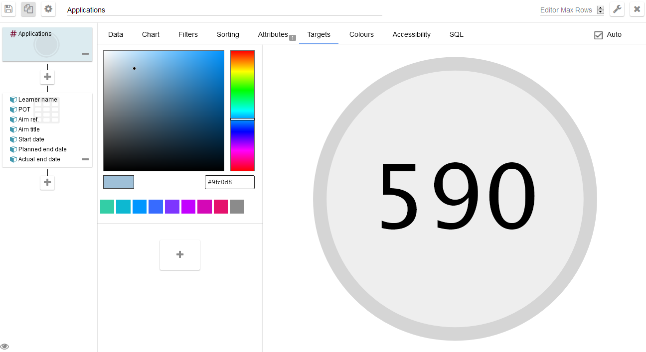
-
Click the
 button to add a target.
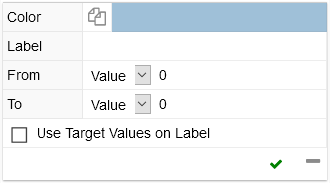
- To set a colour for the target:
- Choose the colour from the colour-picker (above the target box).
Move the mouse cursor over the Color bar in the target box.

- Click the
 button which appears. This will set the selected colour.
- Enter a label for the target.
- Configure the From and To values as required. For each of these, the type of measure can be selected from the dropdown box.
- Click the
 button to additional targets as required. You can remove a target by clicking the
  button at the bottom right of the target box.
 - Click the
 button at the top left of the screen to save the chart.